|
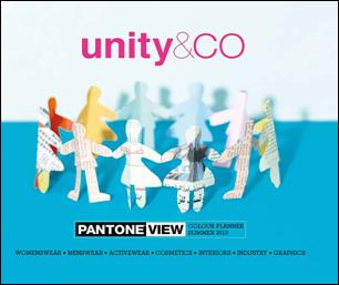
PANTONE VIEW Colour Planner Spring/Summer 2013
Emphasizes
Unity and Connectedness Through Color
Multi-discipline Forecast Provides
Global Color Direction Across Fashion, Cosmetics, Lifestyle, Graphics and
Industrial Design
CARLSTADT, N.J., Sept. 20, 2011 - Pantone LLC, an X-Rite company (NASDAQ: XRIT) and the global authority on
color and provider of professional color standards for the design industries,
today announced the Spring/Summer 2013 edition of PANTONE® VIEW Colour
Planner. This multi-discipline color forecast, titled unity&CO, highlights
the key color palettes for women’s wear, menswear, active wear, cosmetics,
lifestyle and industrial, and graphic design.
 PANTONE VIEW Colour Planner Spring/Summer 2013
pushes individuals to unite with one another again by rediscovering the power
in numbers and embracing a new culture of unity. The power of one can be great,
but the power of many is even more formidable as heritage and traditions are rediscovered
in a modern, digitized manner. PANTONE VIEW Colour Planner Spring/Summer 2013
pushes individuals to unite with one another again by rediscovering the power
in numbers and embracing a new culture of unity. The power of one can be great,
but the power of many is even more formidable as heritage and traditions are rediscovered
in a modern, digitized manner.
The same applies to color, as it too evolves from creating an awestruck response by
its power and brightness alone. As the use of color increases, it becomes more
connected to material, shape and form in an integral way.
“Recent color block stories on the catwalk have paved the way for a new sense of color
confidence among consumers. For some time, color alone has been a significant
factor in purchasing decisions. Today, equally important is the context of
those color statements – the finish, fabric and form in which it is used,” said
Laurie Pressman, vice president of fashion, home and interiors at Pantone.
PANTONE VIEW Colour Planner Spring/Summer 2013
contains the following eight palettes:
-
CO-nversation
Slowly emerging from white, mauve and fuchsia
develop into delicate hues, while a warm sand tone forms a stable base for the
more ethereal pink. The resulting range is subtle and delicate, infusing a
sense of calm and serenity.
-
CO-llaboration
A new approach to neutrals, dusted pink,
greeny-blue and burnt yellows create a family of easy base colors for outerwear
and interiors alike.
-
CO-nnected
Connected is a color range for celebrating
enthusiasm and the vitality of life, as yellow emerges from pure white, diluted
and matte at first then gaining energy to end up reflecting the sun.
-
CO-mmunity
A new level of natural colors which are easy
to mix and use, replacing black for a far more exotic approach – dry browns,
watered browns, wood browns and earth browns.
-
CO-ntain
Based on naturals; simple, refined whites
like eggshell; flesh tones, which reinforce the belief that neutrals are
becoming more colored; warm and static black with deep navy and duck-egg blue.
-
CO-mpanion
A monumental simplicity of colors with their
feet in nature suggests combinations of confident opposites or intimate
tonalities. It is a core baseline palette of blues that frames and sets all the
key accents.
-
CO-llective
Brights move from the primary spectrum of
past seasons into a new fluorescent range. These super strong colors are paired
with a family of soft sisters: five sweetened pastel tones.
-
CO-nvivial
Satisfying a demand for brighter color, but
framed in more tasteful tones, the conviviality palette has all the personality
one would expect from a family of brights, but allows for a more practical color
application.
unity&CO also looks at how color has
evolved and become more connected to one another:
- Blues are turning away from the watery hues of the past and becoming more of a basic
building block, assuming the role that black used to play.
- Color seems to be touching everything – even eternal neutrals like sand and beige. Neutrals
have transformed and the new calling is for basic tones that are shaded and
imbued with peaceful and beautiful color.
- Brights continue to evolve as they are paired together or weaved into larger groups,
exuding drama and newness.
- Metallics have moved away from all-over surface coatings to integrated and broken effects
worked within structures and materials.
- Blacks have no beginning and no end – it has been reborn not as one single black but
transformed into many different disguises, intensities, and militant options as
a result of its marriage to light, texture, material and depth.
- The
importance of Brown remains – not just in their own right, but as alternative
base colors and companion tones in harmonies.
Published bi-annually and 18 to 24 months in advance of the
season, the PANTONE VIEW Colour Planner is based on the PANTONE
FASHION + HOME Color System, the most
widely used and recognized color standard in the world. The book is produced by
a team of leading visionaries from all over the world with expertise in
different disciplines, providing a comprehensive color-forecasting service for
multiple design areas.
Within each of the season’s most directional color
palettes, a general introduction outlines the colors included and the
philosophy behind them. In addition, a specific breakdown of each palette highlights
harmonies, suggested color combinations, and suitable patterns and fabrics
according to end use. Individual color swatch cards for all 62 colors, housed
in a protective box at the back of the book, are also included, along with a CD
containing imagery for use in presentations and storyboards.
Pricing and Availability
The PANTONE VIEW Colour Planner Summer 2013 is available immediately for U.S. $750
from Pantone at www.pantone.com/vcpss2013
or from PANTONE distributors nationwide. Visit www.pantone.com
or call (888)PANTONE for a list of distributors. PANTONE VIEW Colour Planner is published
bi-annually by Metropolitan Publishing BV.
About Pantone
Pantone, a wholly owned subsidiary of X-Rite, Incorporated, has been the world’s color
authority for nearly 50 years, providing design professionals with products and
services for the colorful exploration and expression of creativity. Always a
source for color inspiration, Pantone now offers paint and designer-inspired
products and services for consumers. More information is available at www.pantone.com.
About X-Rite
X-Rite, Incorporated, is the global leader in color science and technology. The
company, which now includes color industry leader Pantone, develops,
manufactures, markets and supports innovative color solutions through
measurement systems, software, color standards and services. X-Rite’s expertise
in inspiring, selecting, measuring, formulating, communicating and matching
color helps users get color right the first time and every time, which
translates to better quality and reduced costs. X-Rite serves a range of
industries, including printing, packaging, photography, graphic design, video,
automotive, paints, plastics, textiles, dental and medical. For further
information, please visit www.xrite.com.
PANTONE®…The
color of ideasSM
PANTONE®
and other Pantone trademarks are the property of Pantone LLC. ©2011. All rights
reserved.
|